This is relevant not only for the obvious reason but also because it was for my wife's sister and her husband. That's right, the wedding coming up this Monday will be the second of my sibling-in-laws to get married on Chanukah. And if I recall correctly the Epsteins wedding was on the 6th night of Chanukah, hence the six candles in their monogram.

The above monogram doesn't impress me nearly as much now as I remember it did. I think it's because they printed it as a blind emboss, or for those who don't speak the lingo - it was on a white invite raised without any ink, just white on white - and it looks spectacular (I have a hard copy somewhere). Now the black and white version doesn't look good to me, it's not fancy enough.

This one for Moshe and (Malka? Miriam?) Sanders is interesting because it takes advantage of a loophole in my monogram making rulebook. The rules state that both the Bride and Grooms initials should have approximately the same visual value. I would never completely hide one of their names while giving the other the spotlight. But in this case, when they both have the same letter, who's to say which Mem is for who? :)

I really don't remember much about the above monogram. It may have been a proposal for a client or just something I did for fun. Had it been fully resolved I imagine it would have been a little different. But maybe not, maybe this is how it went to print. I dunno, I kinda like it. Do you?

This was for a sephardi couple and my intention must have been to give it a Middle-Eastern vibe. It's doubly interesting for me because of the two letter last name - Ben Zaquen.
The next monogram is probably my favorite:

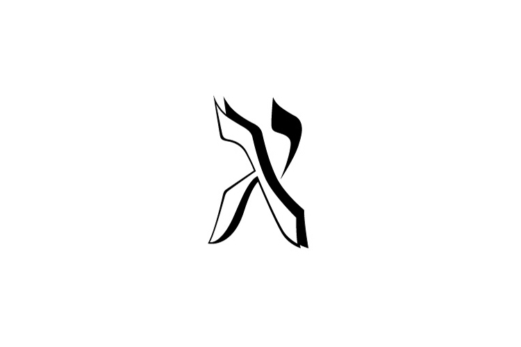
A few of the details in it really turn me on. I wouldn't mind revising the Yud a little but I remember working on this one for a long time, and now that it's done, it's done.


Those last two were created together. First I stumbled upon the color one and I think it excites me as much today as it did when I first realized it. It's perfect. That compact little shape, the little flair on the top, the use of color! I begged my client to print it in color but it would've cost too much. Since then I have actually had a few of my clients print my monograms in color but I really hope one day to see this one in the mail. So, not wanting to disappoint my client (or myself) I struggled to adapt the color version and come up with an equally awesome B&W design. The two colors in the first version are used to distinguish the first initials and without using color I had to find another way to separate the letters while keeping them similarly positioned within the Shin. The final treatment used this angular design to solve the problem. While my heart will always lie with the color version of this monogram, I'm rather proud of the black and white version too (if I may say so myself ;)
Don't have much to say- but I don't want you to be lonely. ~Cuz
ReplyDeleteI love that your art still excited you years later. I often find that the longer I look at one of my "pieces" the more difficulty I have with it. Even if everyone else loves it. Perhaps it's a lacked of honed (sp) skills or perhaps it's just the perfectionist inside getting the better of me
ReplyDelete